Color is the silent director of the wedding weekend. Before a guest tastes the menu, hears the acoustic orientation of a space, or observes the fluid movement of silk, the palette has already established the emotional boundaries of the environment.
As we navigate the 2026 season and look directly toward the peak of 2027, the visual vocabulary of the premium bridal world has undergone a profound cleansing. The predictable, highly saturated color recipes that once dominated social media algorithms – those stark, contrast-heavy palettes or flat, cold greiges – have vanished from contemporary design conversations.
Instead, the modern editorial eye is favoring a layered, fashion-forward approach to color. The 2027 wedding aesthetics treat color not as surface decoration, but as an architectural material that must work in absolute harmony with light and fabric. Driven by the global wave of the refined minimalism bridal style and the quiet precision of the stealth wealth wedding, color has become both softer and more daringly intellectual. The biggest shift of the 2026–2027 cycle? The concept of perfectly matched color wheels is dead; today, it is all about mixing unexpected, interior-design-coded hues to create a layered mood rather than a rigid scheme.
Warm Ivory, Parchment, and All Manner of Brown
There is a vast difference between a plain white wedding and a masterfully curated monochromatic environment. The most sophisticated iterations of the quiet luxury wedding trend right now are entirely anchored in the exploration of earthy, grounded neutrals, building depth entirely through texture rather than pigment.
We are seeing designers completely step away from clinical, blue-toned stark whites in favor of a much warmer, lived-in palette:
The Layered Neutral: Layers of warm ivory, unbleached stone, raw parchment, and rich, interior-design-coded browns like mocha and espresso.
The Execution: The luxury lies entirely in the weight and grain of the mediums. Rich chocolate brown tones are replacing harsh black accents, showing up in heavy linen tablecloths, dark walnut bentwood chairs, and raw ceramic chargers.
This approach turns color into a tactile experience. It mimics the effortless confidence of a Saint Laurent salon or an architectural residence in Brussels – an aesthetic that feels completely resolved because it refuses to shout. For couples looking to capture this level of confident restraint, our master blueprints in the Luxury weddings archive provide an extensive guide to hosting a celebration defined by composition over spectacle.
Photo: PINTEREST
Chartreuse, Cobalt, and Bitter Chocolate
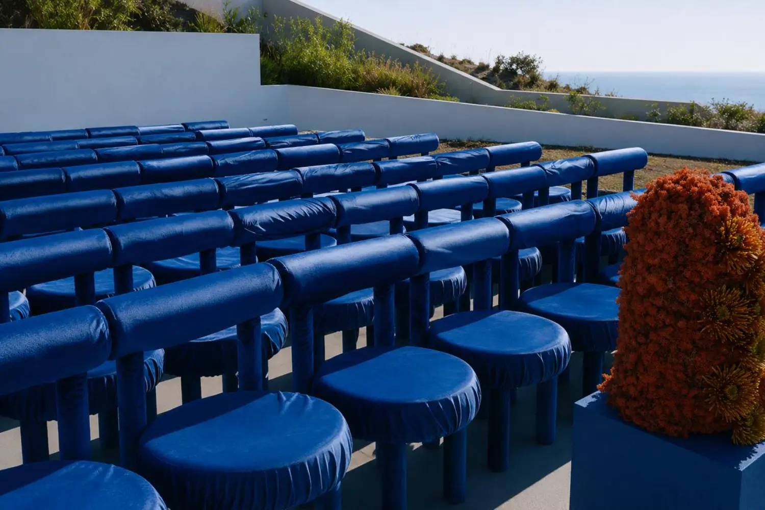
In a beautiful shift that defined luxury wedding design 2026 and has accelerated into 2027, the runway has completely infiltrated the reception. High-fashion house colorways are being used to introduce sharp, editorial contrast into classic spaces.
The standout, "It-Girl" shade of the season is chartreuse – that punchy, slightly rebellious yellow-green that brings an instant contemporary energy to traditional venues. When paired with sophisticated, grounding tones, it transforms a space entirely:
The Contrast: Chartreuse and vibrant cobalt blue layered against a base of deep espresso brown or matte slate.
The Application: This is not about overwhelming a ballroom with neon; it is about the "pop of color" theory. Think custom-tinted minimalist glassware, clean sculptural floral groupings, or an unexpected silk ribbon tying an otherwise clean stationery suite.
To execute a design of this caliber, a couple must collaborate with artists who treat decor as spatial storytelling rather than flat styling. If you are currently sourcing design teams who understand how to manipulate tone and environment without slipping into visual excess, explore our directory of top-tier creators in the Wedding decorations vertical.
Photo: PINTEREST
Deep Crimson, Oxblood, and Faded Sky
For fall, winter, and late-evening estate dinners, romance has taken a distinctly moody turn. Blush pink has officially grown up, evolving into a much cooler, sophisticated older sister: dusty rose paired with deep, "jammy" reds like oxblood, wine tones, and rich crimson.
Rather than looking heavy, modern designers are keeping the look fresh by introducing a cool-girl classic as a gentle romantic contrast: a soft, pale blue with delicate grey undertones.
The Atmosphere: This palette belongs indoors, within historic vaulted cellars, wood-paneled libraries, or grand stone châteaux.
The Styling: Imagine long imperial tables dressed in deep crimson velvet or heavy flax linen, accented by hand-dipped taper candles that cast a soft glow across washed-sky blue porcelain. The floral elements become structural sculptures – perhaps a single variety of deep, dark burgundy flora arranged with graphic precision.
This editorial layout has also completely transformed bridal party styling, shifting away from uniform bridesmaid dresses toward a sophisticated brief where attendants wear varied silhouettes within the same rich color family.
Photo: PINTEREST
How Color Redefines the Timeless Luxury Bridal Style
The evolution of palette has naturally reshaped contemporary bridal design. As the modern bride moves away from heavy embellishment and towards precision tailoring, the color of the gown itself has become an intentional design choice.
We are observing a complete shift toward rich, warm tones within our Wedding dresses curation. Brides are bypassing traditional optic white in favor of silk satins and crepes in shades of silk cream, pale ivory, butter yellow, and antique milk. These warmer tones allow the architecture of a bias cut or a sculptural drape to catch the light with far greater depth and dimension, creating a look that is deeply aligned with a timeless luxury bridal style.
The highly publicized Sophia Richie wedding aesthetic may have introduced this craving for clean, classic silhouettes, but today’s bride is taking it a step further by introducing subtle pops of personal color – such as powder blue velvet shoes, statement veils with subtle pastel embroidery, or an unexpected change into a short, tailored reception look.
Photo: PINTEREST
The Golden Rule: Reject the Algorithm
If there is one definitive takeaway from the 2026–2027 season, it is that a color palette should never be selected because it coordinates with an online template or an automated planning app. Automated calculators and generic inspiration feeds almost always recommend flat, safe combinations that result in a copy-paste aesthetic.
True luxury lies in asymmetry, meaning, and personal resonance. The most unforgettable celebrations are those where the color story feels completely native to the location, the season, and the authentic lifestyle of the hosts. To discover how these shifting design forces are materializing in real-time across the globe, explore the curated features and multi-day visual breakdowns under our dedicated News & Trends editorial archive.
Photo: PINTEREST
How do we prevent a neutral, monochromatic color palette from looking flat or washed out in photography?
The secret to a successful monochromatic design is tactile contrast. When you remove varied pigments from a room, you must replace them with varied textures. Mix rough, open-weave parchment linens with smooth ceramic plates, matte wax candles, and structural, architectural floristry. This variation in material allows shadows and light to catch the surfaces differently, creating immense visual depth in print and digital formats. For real-world examples of tonal mastery, explore the galleries in BrideLifestyle.com’sLuxury weddingshub.
How can we introduce bold tones like chartreuse or cobalt without our wedding looking overly loud?
Embrace the concept of restraint and use them as sharp accents rather than baseline washes. Keep your foundational elements – like your main tablecloths and larger drapes – in grounded neutrals like warm stone, espresso, or cream. Then, introduce your statement shades through small, intentional details: a cobalt blue water goblet, chartreuse taper candles, or custom-printed menu typography. To connect with designers who specialize in this level of spatial balance, search BrideLifestyle.com’s Wedding decorations index.
Does our bridal party palette need to match the reception decor colors exactly?
No; in fact, matching them precisely can often make a celebration feel overproduced and dated. The modern approach is to treat your bridal party as a curated editorial collection. If your reception leans into rich neutrals and deep crimson, your bridal party could wear varied tonal shades of espresso, mocha, and warm taupe. This creates a beautifully fluid visual narrative when they transition into space. For detailed lookbook and independent styling advice, browse BrideLifestyle.com’s Wedding dresses editorial sections
How do we choose an editorial color palette that works with a multi-day destination itinerary?
Instead of using one palette for the entire weekend, allow the colors to transition alongside the location and mood. For a welcome dinner beneath olive trees in Tuscany, lean into soft greens, terracotta, and warm neutrals. For the main wedding day, elevate the tone to a clean, elegant minimalist wedding style featuring ivories, stone, and a single fashion accent. Finally, let a day-two pool lounge embrace playful, sun-soaked citrus or soft yellows. For curated timeline inspiration and multi-day planning advice, follow BrideLifestyle.com’s News & Trends archive.
This website uses cookies to improve the user experience and optimize its performance. By continuing to use this website, you agree to the use of cookies on this website.
Read more

 share
share

.webp)
.webp)
.webp)
.webp)
.webp)


